Best use case
iblai-account is best used when you need a repeatable AI agent workflow instead of a one-off prompt.
Add account and organization settings page to your Next.js app
Teams using iblai-account should expect a more consistent output, faster repeated execution, less prompt rewriting.
When to use this skill
- You want a reusable workflow that can be run more than once with consistent structure.
When not to use this skill
- You only need a quick one-off answer and do not need a reusable workflow.
- You cannot install or maintain the underlying files, dependencies, or repository context.
Installation
Claude Code / Cursor / Codex
$curl -o ~/.claude/skills/iblai-account/SKILL.md --create-dirs "https://raw.githubusercontent.com/iblai/vibe/main/skills/iblai-account/SKILL.md"
Manual Installation
- Download SKILL.md from GitHub
- Place it in
.claude/skills/iblai-account/SKILL.mdinside your project - Restart your AI agent — it will auto-discover the skill
How iblai-account Compares
| Feature / Agent | iblai-account | Standard Approach |
|---|---|---|
| Platform Support | Not specified | Limited / Varies |
| Context Awareness | High | Baseline |
| Installation Complexity | Unknown | N/A |
Frequently Asked Questions
What does this skill do?
Add account and organization settings page to your Next.js app
Where can I find the source code?
You can find the source code on GitHub using the link provided at the top of the page.
SKILL.md Source
# /iblai-account
Add an account/organization settings page with tabs for Organization info,
User Management, Integrations, Advanced settings, and Billing.
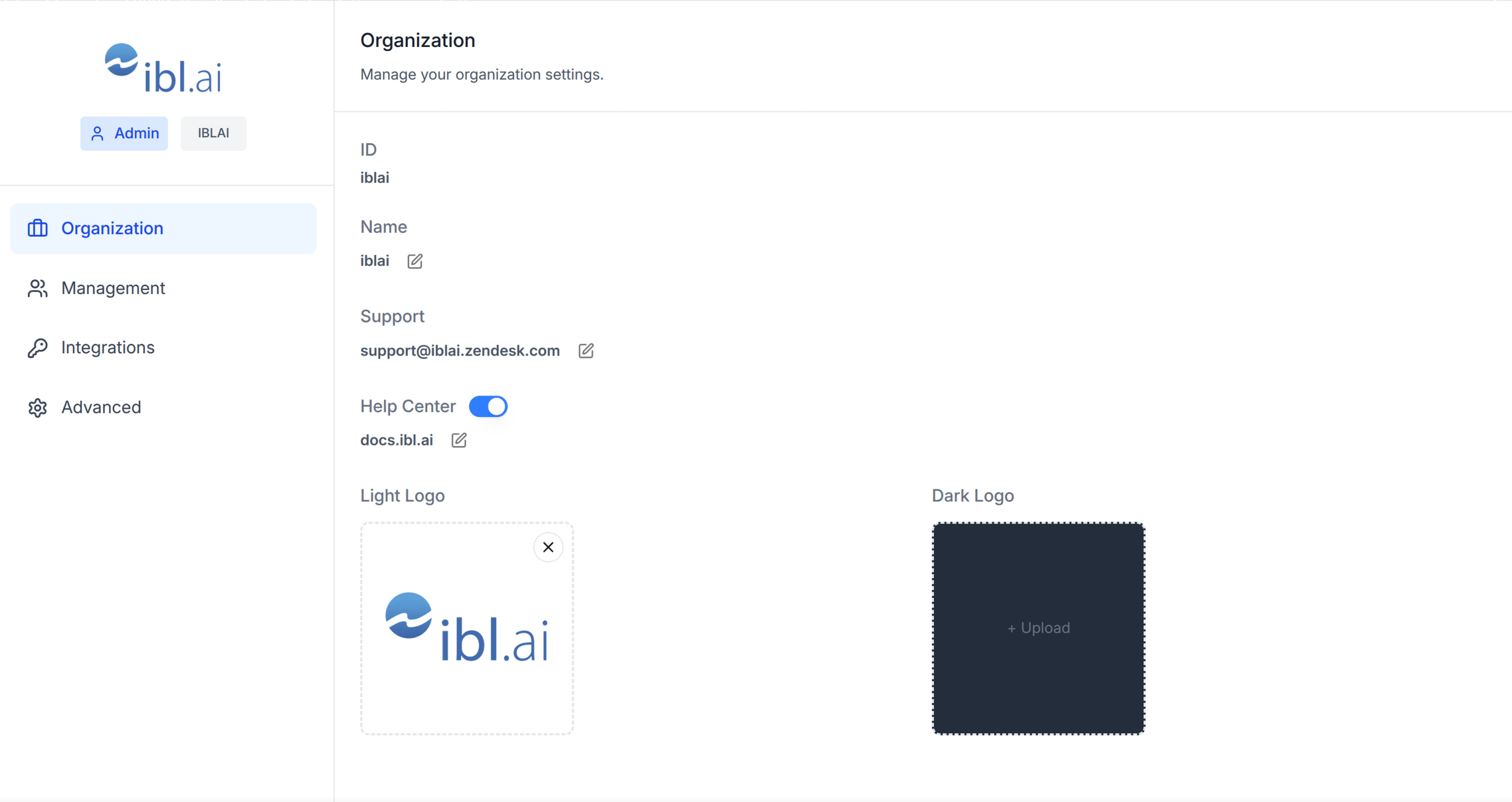
Do NOT add custom styles, colors, or CSS overrides to ibl.ai SDK components.
They ship with their own styling. Keep the components as-is.
Do NOT implement dark mode unless the user explicitly asks for it.
When building custom UI around SDK components, use the ibl.ai brand:
- **Primary**: `#0058cc`, **Gradient**: `linear-gradient(135deg, #00b0ef, #0058cc)`
- **Button**: `bg-gradient-to-r from-[#2563EB] to-[#93C5FD] text-white`
- **Font**: System sans-serif stack, **Style**: shadcn/ui new-york variant
- Follow the component hierarchy: use ibl.ai SDK components
(`@iblai/iblai-js`) first, then shadcn/ui for everything else
(`npx shadcn@latest add <component>`). Do NOT write custom components
when an ibl.ai or shadcn equivalent exists. Both share the same
Tailwind theme and render in ibl.ai brand colors automatically.
- Follow [BRAND.md](https://raw.githubusercontent.com/iblai/vibe/refs/heads/main/BRAND.md) for
colors, typography, spacing, and component styles.
You MUST run `/iblai-ops-test` before telling the user the work is ready.
After all work is complete, start a dev server (`pnpm dev`) so the user
can see the result at http://localhost:3000.
`iblai.env` is NOT a `.env.local` replacement — it only holds the 3
shorthand variables (`DOMAIN`, `PLATFORM`, `TOKEN`). Next.js still reads
its runtime env vars from `.env.local`.
Use `pnpm` as the default package manager. Fall back to `npm` if pnpm
is not installed. The generated app should live in the current directory,
not in a subdirectory.
> **Navbar:** If the user wants a navbar with links to the account page,
> guide them to `/iblai-navbar` first. That skill creates the full navbar
> with logo, page links, notification bell, and profile dropdown.
> **Common setup (brand, conventions, env files, verification):** see [docs/skill-setup.md](https://raw.githubusercontent.com/iblai/vibe/refs/heads/main/docs/skill-setup.md).
## Step 0: Start from vibe-starter? (new projects)
Before running this skill, ask the user:
> Are you starting a new project from scratch? vibe-starter
> (https://github.com/iblai/vibe-starter/tree/spa) already ships the /account
> page wired up, alongside auth, navbar, and profile/notifications. Want to
> use that instead?
If yes, clone into a temp directory and copy into the current directory before
installing (running pnpm install inside the cloned subdirectory causes hardlink
issues), then skip this skill:
git clone -b spa https://github.com/iblai/vibe-starter.git vibe-starter-init
cp -a vibe-starter-init/. . && rm -rf vibe-starter-init
pnpm install
If they prefer to add the account page to an existing app, continue below.
## Prerequisites
- Auth must be set up first (`/iblai-auth`)
- MCP and skills must be set up: `iblai add mcp`
## Check for CLI Updates
Before running any `iblai` command, ensure the CLI is
up to date. Run `iblai --version` to check the current version, then
upgrade directly:
- pip: `pip install --upgrade iblai-app-cli`
- npm: `npm install -g @iblai/cli@latest`
This is safe to run even if already at the latest version.
## Step 1: Check Environment
Before proceeding, check for a `iblai.env`
in the project root. Look for `PLATFORM`, `DOMAIN`, and `TOKEN` variables.
If the file does not exist or is missing these variables, tell the user:
"You need an `iblai.env` with your platform configuration. Download the
template and fill in your values:
`curl -o iblai.env https://raw.githubusercontent.com/iblai/vibe/refs/heads/main/iblai.env`"
## Step 2: Run the Generator
```bash
iblai add account
```
## What Was Generated
| File | Purpose |
|------|---------|
| `app/(app)/account/page.tsx` | Account/organization settings page with tabs |
The page reads `userData`, `tenant`/`current_tenant`, and `tenants` from
localStorage. Admin status is derived from the `tenants` array.
> **Note:** The `Account` component uses `next/image` internally -- it is
> imported from `@iblai/iblai-js/web-containers/next`.
## Step 3: Wrap in a White Container
The SDK Account component has no outer background. Wrap it in a white
container so it renders as a card against the gray page background
(`--sidebar-bg: #fafbfc`).
### Reference implementation
```tsx
// app/(app)/account/page.tsx
"use client";
import { useEffect, useState } from "react";
import { useRouter } from "next/navigation";
import { Account } from "@iblai/iblai-js/web-containers/next";
import config from "@/lib/iblai/config";
import { resolveAppTenant } from "@/lib/iblai/tenant";
export default function AccountPage() {
const router = useRouter();
const [username, setUsername] = useState("");
const [tenantKey, setTenantKey] = useState("");
const [tenants, setTenants] = useState<any[]>([]);
const [isAdmin, setIsAdmin] = useState(false);
const [ready, setReady] = useState(false);
useEffect(() => {
try {
const raw = localStorage.getItem("userData");
if (raw) {
const parsed = JSON.parse(raw);
setUsername(parsed.user_nicename ?? parsed.username ?? "");
}
} catch {}
const resolved = resolveAppTenant();
setTenantKey(resolved);
try {
const tenantsRaw = localStorage.getItem("tenants");
if (tenantsRaw) {
const parsed = JSON.parse(tenantsRaw);
setTenants(parsed);
const match = parsed.find((t: any) => t.key === resolved);
if (match) setIsAdmin(!!match.is_admin);
}
} catch {}
setReady(true);
}, []);
if (!ready || !tenantKey) {
return (
<div className="flex flex-1 items-center justify-center">
<p className="text-sm text-gray-400">Loading account settings...</p>
</div>
);
}
return (
<div className="mx-auto w-full flex-1 overflow-auto px-4 py-8 md:w-[75vw] md:px-0">
<div className="rounded-lg border border-[var(--border-color)] bg-white overflow-hidden">
<Account
tenant={tenantKey}
tenants={tenants}
username={username}
isAdmin={isAdmin}
authURL={config.authUrl()}
currentPlatformBaseDomain={config.platformBaseDomain()}
currentSPA="agent"
onInviteClick={() => {}}
onClose={() => router.push("/")}
targetTab="organization"
showPlatformName={true}
useGravatarPicFallback={true}
/>
</div>
</div>
);
}
```
### Key patterns
- **White container wrapper**: Wrap the `Account` component in a
`bg-white rounded-lg border border-[var(--border-color)] overflow-hidden`
div so it renders as a card against the gray page background.
- **Responsive width**: `w-full px-4` on mobile, `md:w-[75vw] md:px-0`
on desktop.
## Step 4: Use MCP Tools for Customization
```
get_component_info("Account")
```
## `<Account>` Props
### Required
| Prop | Type | Description |
|------|------|-------------|
| `tenant` | `string` | Platform key |
| `tenants` | `Tenant[]` | Full list of user platforms from localStorage |
| `username` | `string` | Username |
| `onInviteClick` | `() => void` | Called when "Invite user" is clicked |
| `onClose` | `() => void` | Cancel/close callback |
| `authURL` | `string` | Auth service URL |
| `isAdmin` | `boolean` | Controls tab visibility -- most tabs require `true` |
### Optional
| Prop | Type | Description |
|------|------|-------------|
| `targetTab` | `string` | Initial tab: `organization`, `management`, `integrations`, `advanced`, `billing` |
| `currentPlatformBaseDomain` | `string` | Base domain for custom domain settings |
| `currentSPA` | `string` | Current app identifier (e.g., `"agent"`) |
| `billingURL` | `string` | Stripe billing portal URL -- shows Billing tab |
| `topUpURL` | `string` | Stripe top-up URL -- shows Billing tab |
| `enableRbac` | `boolean` | Enable RBAC permission checks for Management |
| `showPlatformName` | `boolean` | Show platform name badge in sidebar |
| `useGravatarPicFallback` | `boolean` | Use Gravatar when no org logo |
## Tabs
| Tab | Requires |
|-----|---------|
| **Organization** | `isAdmin === true` |
| **Management** | RBAC permissions |
| **Integrations** | `isAdmin === true` |
| **Advanced** | `isAdmin === true` |
| **Billing** | `billingURL` or `topUpURL` prop set |
## Step 5: Verify
Run `/iblai-ops-test` before telling the user the work is ready:
1. `pnpm build` -- must pass with zero errors
2. `pnpm test` -- vitest must pass
3. Start dev server and touch test:
```bash
pnpm dev &
npx playwright screenshot http://localhost:3000/account /tmp/account.png
```
## Important Notes
- **Next.js required**: Import from `@iblai/iblai-js/web-containers/next` (uses `next/image`)
- **Redux store**: Must include `mentorReducer` and `mentorMiddleware`
- **`initializeDataLayer()`**: 5 args (v1.2+)
- **`@reduxjs/toolkit`**: Deduplicated via webpack aliases in `next.config.ts`
- **`currentPlatformBaseDomain`**: Must be `{config.platformBaseDomain()}` — uses the config helper, not a raw env var. This is correct and intentional.
- **SDK hardcoded styles**: The SDK Account component uses `bg-white` and
`bg-gray-50` internally. Do NOT override these. Instead, wrap the component
in a white container so it renders correctly against the gray page background.
- **Brand guidelines**: [BRAND.md](https://raw.githubusercontent.com/iblai/vibe/refs/heads/main/BRAND.md)Related Skills
We are still matching the closest adjacent skills for this page. In the meantime, continue through the full directory.